
From Grapes to Graphs: Unveiling Wine Data Patterns Using Spotlight
Data visualization is the cornerstone for analyzing, understanding, and communicating insights about your machine-learning data. The classical workflow can be summarized simply: We load the data in a notebook, create some statistical overviews, and begin plotting the distribution of feature values. Shortly after, we find ourselves executing code-cell for code-cell in a Jupyter Notebook, configuring and searching through dozens of plots in the hope of finding some new insights.
In this article, we will study a wine dataset consisting of various chemical properties of wine and do things differently. We will utilize an interactive tool for data visualization and exploration, and reduce all code work to a single line of code to find out what makes red and white wines different from each other.
tl;dr:
Traditional methods for data visualization can be cumbersome and lack interactivity. Spotlight, an Open Source Tool, offers a streamlined and interactive approach to exploring data. It simplifies visualization creation, supports custom views, and allows effortless interaction with data points. You can install the package with **pip install renumics-spotlight **and explore your DataFrame as follows:
from renumics import spotlight
spotlight.show(df)
Outline
-
Struggles introduced by the Classical Workflow
-
Hands-On Practice: A basic walk-through on the classical way.
-
Hands-On Comparison: Interactive Exploration with Spotlight.
-
What are the differences between red and white wine?
Struggles introduced by the Classical Workflow
I want to mention only a few problems that occur when creating data visualizations in Python and Jupyter Notebooks.
-
The code-block-based nature of Jupyter Notebooks can become cumbersome when working on extensive visualization projects. As notebooks grow in length, it becomes increasingly difficult to manage and maintain the visualizations and associated code.
-
Another struggle is the iterative code execution in Jupyter Notebooks. Making changes to the visualization code and re-running the entire notebook can be time-consuming and inefficient, especially when dealing with large datasets or complex visualizations. Making small changes anywhere in the notebook easily leads to execution errors after a restart.
-
Python provides an array of libraries that cater to different aspects of data visualization, including seaborn and matplotlib. While this variety of libraries offers flexibility, it can also lead to decision paralysis and confusion when selecting the most appropriate tool for a specific visualization task.
These challenges hinder your productivity and make data visualization and exploration tedious work.
Step up your data visualization game!
Instead of blindly following this code-cell-centric scheme for the coming decade, we should have a look at more modern tooling for exploratory data analysis.

The Open Source Tool Spotlight aims to simplify and streamline the data visualization experience for any kind of data — tabular, unstructured, multi-modal — in an interactive, and explorative manner. It provides a user-friendly interface that simplifies the creation of visualizations and enables custom views of your data.
With Spotlight, we can swiftly …
-
generate views like scatter plots and histograms,
-
filter, group, select, and inspect single data points,
-
view numerical and categorical features in a table view,
-
lazy-load huge files,
-
explore the similarity of data points on the Similarity Map.
all within a single interface.
Visit Spotlight’s GitHub Repo for more information.
Hands-on Practice: The Classical Way
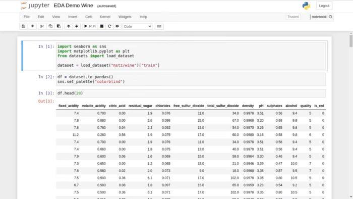
Let’s load the wine quality dataset from Hugging Face for our exemplary data visualization and exploration task. Further down in the article, we will find out what makes a good wine.
from datasets import load_dataset
dataset = load_dataset("mstz/wine")["train"] df = dataset.to_pandas()
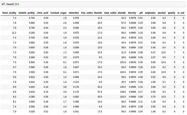
For a **table **view on the DataFrame, we can call df.head().
One visualization per code-block
Next, we import our visualization libraries — for simplicity, we do everything with seaborn — and begin plotting the data through code manipulation.
import seaborn as sns
sns.set_palette("colorblind")
To have a look at the dataset’s target value distribution, we can create a histogram from the values in the “quality” column. While simple to use in the beginning, the configuration can be exhaustive and the results are not interactive, and somehow a bit underwhelming.
sns.histplot(x=df["quality"])

A more configured view of the same data can be achieved by setting the **hue **argument and adding a title.
sns.histplot(x = df["quality"], hue = df["quality"], palette = "colorblind").set(title = "Distribution of 'quality'");

Looking at a subsection of data can be done by filtering the Pandas DataFrame. For example, we can create a histogram for white wines only.
sns.histplot(x=df[df["is_red"] == 0]["quality"])

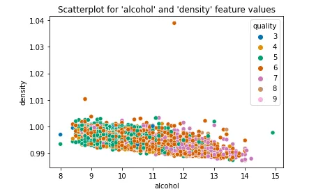
Creating a scatterplot with seaborn is simple. Select the x and y feature columns and pass the data. However, creating plots for different feature pairings requires the repeated execution of the cell with a manually changed configuration.
sns.scatterplot(x = "alcohol", y = "density", hue = "quality", palette = "colorblind", data = df).set(title = "Scatterplot for 'alcohol' and 'density' feature values");
To uncover differences between red and white wines, the subsequent actions are straightforward yet not clearly defined. We need to examine the distributions of all feature values grouped by the wine type, which involves creating numerous plots, only a fraction of which prove informative.
Hands-on Comparison: Explore your Data Interactively with Spotlight.
By interactively exploring data, we can overcome the challenges associated with data visualization mentioned above. Spotlight eliminates the need for extensive coding, reduces the overall code length, and empowers users to configure multiple custom views on their data interactively and side-by-side.
You can install Spotlight with pip:
pip install renumics-spotlight
And a single line of code will do the magic 🪄 (imports aside …)
from renumics import spotlight
spotlight.show(dataset.to_pandas().drop_duplicates())
Et voila, no setup, fast, and interactive visualization 😊
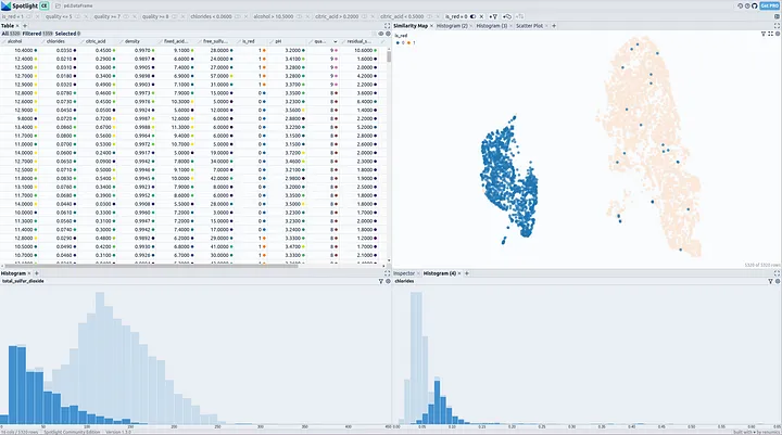
What are the differences between red and white wine?
Now, let’s have a look at the wine dataset through the lens of Spotlight in order to answer the question.
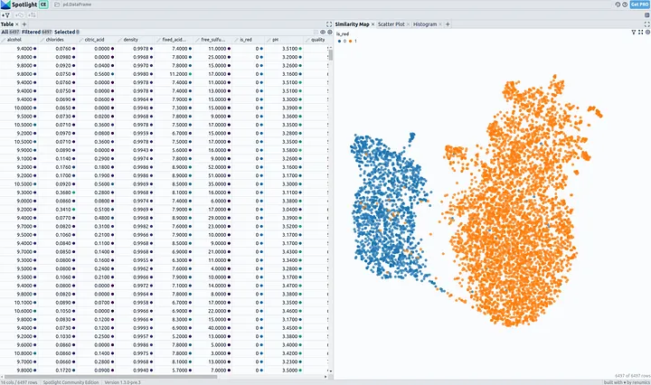
When looking at the Similarity Map, we clearly see that white and red wines have different characteristics and create separate clusters.

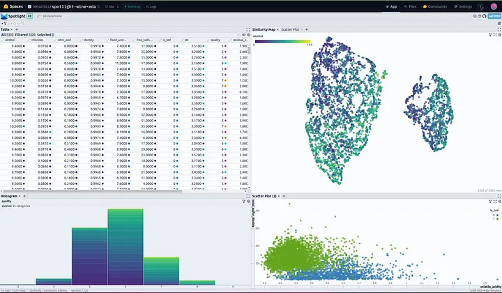
After finding some clues for relevant features describing wine types in the Similarity Map, we should have a look at the distribution of these feature values with Histograms.

We can see that the features of volatile acidity, total sulfur dioxide, and chlorides separate red and white wines to a certain degree. It should be possible to distinguish between red and white wines when looking at their combination.
Our Findings:
-
Volatile acidity is in general lower for white wines, and higher for red wines.
-
Red wines have a higher amount of total sulfur dioxide.
-
White wines have more chlorides (salt)
-
**Goodie: **Better-quality red wines contain less chlorides than average red wines. Also, the alcohol level of better-quality wines (8+) is generally higher. Cheers!
Add some findings yourself by playing around with the dataset in this HF Space

Conclusion:
While data visualization in Jupyter Notebooks can be cumbersome, Spotlight introduces an intuitive, interactive, and efficient exploration of data, as demonstrated in the EDA for the wine dataset. Spotlight not only simplifies the process but also enhances insights, exemplifying a modern approach to efficient data exploration and visualization.
Thanks for reading! My name is Marius, I’m a Machine Learning Engineer @ Renumics — We have developed Spotlight, an Open Source Tool that takes your data-centric AI workflow to the next level.
If you’ve read this far, I’d recommend you to check out our WINE-EDA demo on HuggingFace Spaces.